Williams-Sonoma
Driving Customers to Stores
Desktop Site Feature Integration
Project Scope
Two-week project: one week with a team to aggregate research, one week solo to design and prototype a solution
Research Team
Shuhan Yu - Andy Morris - Talia Saltzman
Tools
Heuristic Analysis - Competitive Research - Online and In-Person Contextual Inquiries - Screener Survey - User Interviews - Rapid Prototyping - Usability Testing
Today's multi-channel shopper
n=37 Survey Respondents
The Problem Space
Williams-Sonoma dominated the home & gift retail category since its inception in 1956. The centered its business around its store presence, offering a consistently serene, warm, and inviting shopping experience across all of its stores. Customers could rely on Williams-Sonoma for quality products, customer service, and its welcoming and beautiful and homey stores. However, as e-commerce took off, Williams-Sonoma's growing online sales cannibalized its in-store traffic, with Williams-Sonoma currently generating over half of its revenue through its website. Despite various omnichannel investments attempting to drive customers to stores, the brand's physical store footprint is shrinking year over year. While the brand's website allows customers to shop its entire product offering, the brand's stores remain its positive and competitive differentiating factor from its other competitors.
Today’s multichannel shoppers have to choose between the amenities offered in-store and the convenience of shopping online.
Most customers prefer to shop in the Williams-Sonoma store, but have a hard time fitting it in their schedule. How might we better connect the Williams-Sonoma’s online and offline presences into one seamless experience, so that customers can access the best of what Williams-Sonoma has to offer.
How do customers prefer to shop - platform selection
n=37 Survey Respondents
Approach
Williams-Sonoma's strength is its stores. In order to continue to drive customers to stores - most customers' preferred method of shopping - I aimed to improve the brand's on-site appointment booking process.
Initial Sketches
What Usability Tests Revealed
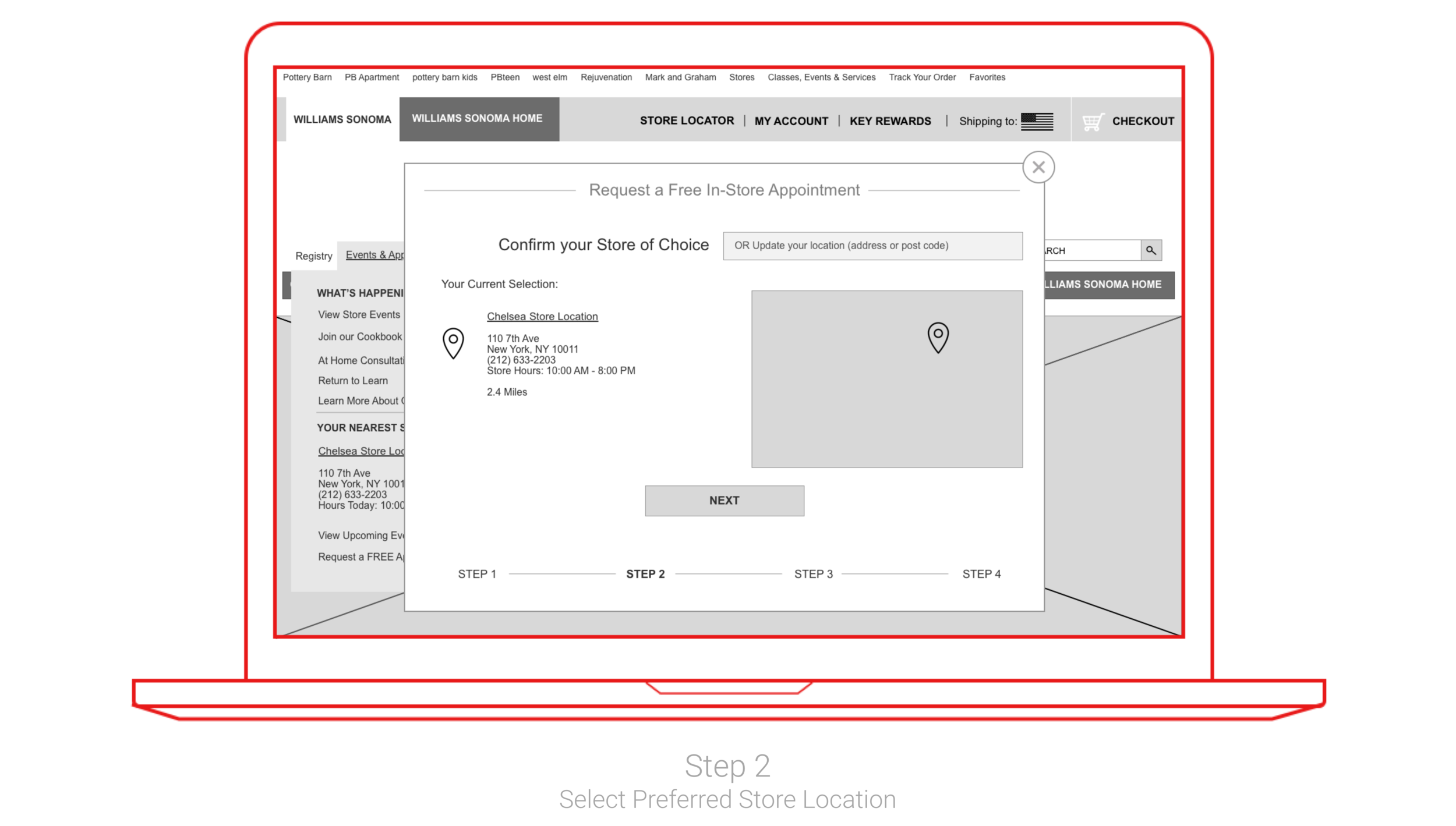
Usability tests on the low-fidelity prototype revealed that participants positively received having an indication of how long the process to request an appointment was and what stage in the process they currently were. However, participants were most confused about where to locate the appointment booking tool within the website's existing main navigation menu. We addressed this issue by moving the store locator tool to the permanent header and changing the name under which people would find the appointment booking tool from "Stores" to "Events and Appointments".
Moving to Mid-Fidelity
What Usability Tests Revealed
Testing the mid-fidelity prototype revealed that participants sought out in-store appointments through the product page, rather than directly selecting the option from the main navigation menu. This emphasized that potential customers are requesting appointments for different reasons: the appointment option of learning to use a product in-store is often driven during product discovery and while on a specific product page. This finding highlights importance of having multiple pathways to booking an appointment.
Additionally, participants wanted more more visual cues that their appointment had been booked, which I tackled by adding a summary screen within the appointment booking process.
Moving to High-Fidelity
Tested Task Scenarios
1. Book an in-store appointment to learn how to use a new product
2. Browse for blenders under $200 and add to cart
Measuring Success
The two featured (appointment booking and product filtering options - including being able to filter product selections by in-store availability) are intended streamline product discovery and drive traffic to store. These feature integrations will ultimately be successful if they result in more store visits, especially in the form of store appointments.
Next Steps
1. Test the prototype in high fidelity
2. Research and redesign Williams-Sonoma's double main navigation menus
3. Build out and test mobile site based on desktop site revisions


